November 26, 2013

we meet again, blog

whew, been a busy few weeks! here's a few concept paintings from a mobile game project i've been working on over the past few months. more to come!


October 31, 2013

life drawing + brief surface pro thoughts

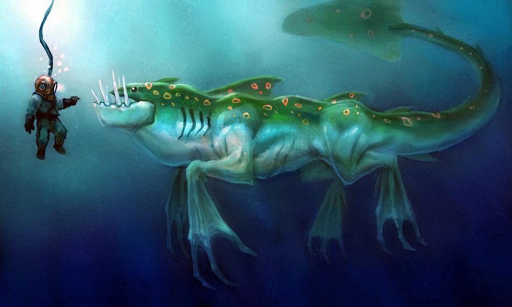
life drawing from last week. sorry for the lazy cut out job. 


these are from the surface pro's first life drawing outing this week. it was a lot of fun, though a little uncomfortable. going to have to really experiment with my setup! 


so, overall, the surface pro 2 has been great. its been a joy to work and play on. it's pretty much what i expected it to be: a mobile art station. it runs photoshop beautifully, among other art programs, while also functioning well as a tablet (games, internet browsing, etc). i've been quite impressed with the battery life so far, though i need to do a few tests from 100%-0%. from what i've seen so far, i should be able to get approx. 5 hours of heavy painting time in. 

not everything has been all sunshine and rainbows, though. the pen accuracy is all over the place. in the top corners, the accuracy is completely terrible, and over the rest of the screen, it's very inconsistent. not that its unusable, as i've done lots of drawing on it already, but, for a premium device, is unacceptable. i spent a week, or so, troubleshooting and researching, and it seems that the issue is fairly common. after chatting with microsoft tech support a few times, i've concluded that this is a hardware defect. a replacement is being shipped to me as i type this, so hopefully that'll remedy the issue. 

one other strange issue, which i've yet to figure out is this...


i think its an issue with wacom's drivers, as they're needed for photoshop to even recognize pressure sensitivity. basically, if i have opacity set to pen pressure, and the "tip feel" in the wacom settings in the control panel set to the normal, medium setting, i cannot get an opaque stroke when i press down fully. i mean, i'd have to press with all of my manly might in order to get an opaque stroke. that's just not cool. i remember reading somewhere that wacom is aware of issues with win8.1, so hopefully they're going to fix this. again, not a big deal, and it doesn't make photoshop unusable, but it sure is annoying.

October 26, 2013

fresh digital paint

another fresh paint sketch, this one was a bit quicker for whatever reason. may have to try out a portrait or something soon. 


October 25, 2013

Fresh Paint 2

Another Fresh Paint warm-up sketch. Reflections are hard. Note to self: get more materials practice in.


October 24, 2013

Fresh paint sketch

Did this today with the Fresh Paint app on my new, fancy-pants Surface Pro 2. Really been enjoying this device. More to come, soon!


October 23, 2013

yes, more animals

more animals! mwhahaha! really been enjoying these.


October 21, 2013

color studies

been posting a lot of studies recently.. will have to post some original art soon. but, for now, here's a few random color studies i've done from photos as warm-ups over the past month or two. quick and dirty.


October 18, 2013

aminals

decided that it's high time i started doing some animal studies. figure i need to increase my visual library, and going between mechanical studies and organic studies is probably a good start. also, i noticed my portfolio has a severe lack of creature concepts, which i cannot abide. there is something, super top-secret, that i'm working on which will certainly help my portfolio in that regard. more on that later. bwhahaah.


clearly, i had a lot more time when i was drawing elephants.

October 17, 2013

skullz

skull studies from photos. note to self: buy some skulls to study.


October 15, 2013

more expression studios

i've really been enjoying these, both as a warm-up, and just a general exercise. as you can see, some are more successful than others, but that's to be expected, i suppose.


thanks for looking!

October 11, 2013

a few more

moar!


inktober?

hey blog, sorry for neglecting you. here's some warm-up sketches! 


from a book of expressions that i'm... "borrowing" from my girlfriend. mwhahahaha.

October 1, 2013

listo marking leads + marking leads holder

finally. i've been meaning to get my hands on these for quite a while. i love using china markers for life drawing, but hate using china markers for life drawing. the string always gets in the way, always having to peel it at inopportune moments... but they feel great on newsprint, and force me to not focus on details (which is an old habit i'm constantly battling). these allow me to keep the positives, and get rid of the negatives. i frakking love you listo marking lead holder thing.


just a simple twist and i'm back to drawing. 

life drawin

here's a few from last night. still fighting some natural tendencies to rush into things, which causes me to not analyze the figure as a whole. i jump head first into the figure, playing with the shapes before establishing a foundation for them to rest. patience, i need.


September 25, 2013

character paintings

forgot to post these, but painted these for a client several months back. did a quick mock-up to show the general process. on the second character, the client wanted the hat and belt toned down for the final.


September 24, 2013

Misc vehicle studies

Been doing these vehicle studies fairly frequently to warm-up, and absorb some of that juicy mechanical shape language. Next step, concept some vehicles, and see if any of it stuck!


September 18, 2013

Lizards!

 Couple o' iguana studies for a thing I'm working on.


And this... I didn't make it, but it sure does bring a smile to my face.


Naked people

Sometimes, I like to draw naked people from life. Here's some from the past couple of weeks. 


September 11, 2013

Beep Boop

This past weekend, I accompanied my girlfriend to the Apple store so she could get her phone fixed. While wandering around, drooling over stuff I couldn't afford, I doodled some bots on a few of the display iPads/iPad Minis. 


Decided to do some quick paint-overs on 'em as a warm-up.


September 9, 2013

a quick warm up study turned into this. 


September 4, 2013

Hello blog.

Forgot to post these DOTA2 weapons a while back. Need to do more of these.


And this is a random study... More coming soon, got several things in the works. 


July 17, 2013

pig man doodle

doodled this as both a warm-up, and as a start on a personal project. more on this later.


June 18, 2013

final warlord

blast! i missed the poll by ~10minutes... ah well. was a fun image to do, anyhow.


June 14, 2013

final siren

here's my final submission for the siren creature challenge on cghub. now, to see what the community thinks of it!


June 10, 2013

siren challenge wip

here's my wip for the siren challenge over at cghub. crits if you got em!


time-forgotten warlord

here's a wip of my time-forgotten warlord concept piece for the cghub challenge. any crits, so far? 

June 5, 2013

more dota 2 weapon concepts

still plugging away, trying to get some weapons made and then accepted to the dota 2 store. 


May 29, 2013

dota 2 axe concepts

will probably tweak these before i post 'em on polycount, but wanted to see if anyone had any crits! hoping to get one or all of these made for the dota 2 workshop.


Made a few proportion adjustments/cleaned up A, which was a bit too busy to read in-game.

Original pass. 

Posting on polycount now. We'll see what level of interest there is!

couple 'o morning warm-up studies

did these this morning to get the juices flowing. 


May 28, 2013

Notes, thoughts, sketches, and a few images from SBExplore

Ready thyself for a giant blog post!

Whew. What an event! I learned a lot, met a lot of great people, and even got a bit of sketching done. During each of the seminars, I was feverishly scrawling down notes, which I've attempted to consolidate, decode, and categorize below (very generally).

Tips and tricks (these are pretty specific, but boil down to the importance of experimentation):
  • Paint over refs to explore and discover style early in a project.
  • Play with camera angle in exploratory sketches to help define char/env...
  • Break down characters to most basic elements after you've settled on a design to test it's strength; basically, simplify the shapes as much as possible to test how iconic it is/isn't.
  • Try using color keys on concept pages to easily spot issues in your color.
  • A character's pose is very important to communicate their personality.
  • Use simple forms for composition and form practice (Kekei's sandworm and cowboy images)
  • Set your design before you render!
  • Cannibalization/recycling of previous images, designs, etc...
  • Grab portions of your image early on, stretch and skew them to move paint around instead of hand painting everything.
  • Use the median filter on photos to establish color/value patterns.
  • Break up photos you use in a painting; make sure they're unrecognizable from the source.
  • Hue/Saturation: pick specific colors to adjust in your image.
  • Copy/Merge/Paste; Ctrl+Shift+C, then Ctrl+V to copy a portion of an image that has a bunch elements on separate layers.
  • Use darken/lighten layers to move value blocks.
  • Start with clean shapes when beginning an image, break up later.
  • Use of scatter brushes with multiple different shapes to help generate shapes you might not expect.
  • Pull out blacks/whites with levels in photos you add to images.
  • Use of copy/merge/median/smudge to kill higher res photo info.
  • Atmosphere creation; cloud brushes to create flat shape, then lock layer transparency, apply gradients for light and shadows, then use a rough smudge brush to finesse it.
  • Color balance adjustment layer, then use Color blending mode.
  • Use white paint to reinforce and/or determine lighting with an Overlay layer.
  • Start simple! Try solid black and white to find interesting shapes, keeping it generally hard edged. Your focus is not shape precision or values in the beginning.
  • Try designing with light, sculpting forms with light over darkness.
  • Keep it loose to start!
  • Liquify image to push results; take rough character block-in and liquify.
  • Only add more complex lighting and shadows once the design is pleasing to you.
  • Blend chaos and intention to find interesting results.
  • Try using darken or multiply layers for color, mask it all out, then unmask parts you want to keep.
  • Play with curves more; try multiple points on the graph, also with color channels.
  • Oppose main tension lines in cloth, muscles, etc, with counter strokes.
  • Apply texture, grain, spec, etc., then mask out and keep what you want.
  • Start with simple lighting scenarios!
  • Exposure curve, or proper light balance; start with mid tones, then using highlights and shadows to reinforce mids and add pop.
  • Try starting speed paintings with gradients and mid values, then add darks and lights last for interest
  • Try painting with limited layers, or no layers, then lasso out sections to add in atmosphere, add depth, and adjust colors. Then flatten and clean up edges.
  • Try using Soft Light for color because it doesn't damage values.
  • Try dragging custom shapes around to start an image; can create nice accidents, rhythms, etc...
  • Use the clone stamp to repeat elements (use selections to define shapes to clone in).
  • Periodically try auto tone/color/contract when making an image.
  • Cut and paste pieces of an image of the composition to help unify design.
  • Try graphic brushes for patterns, etc.
  • Create flat designs on a new layer, then warp/distort to fit perspective.
  • Start loose and fast using big rough shapes.
  • Hold shift for straight line, then drag around for crazy hatching (I had to shift+draw a line, then move my brush while repeadetly pressing shift to create this effect... more experimenting will need to happen).
  • Create custom shape libraries to play with.
  • For Color Dodge layers, go to Layer Style, uncheck Blend Clipped Layers as Group, and Transparency Shapes Layer; makes for slightly different results from standard color dodging.
  • Imagine city scape from above, create paths, roads, parks, etc. in a flat shape, then warp/distort into perspective.
  • Try dodging early to set lighting.
  • Play with different smudge brush shapes.
  • Try using the Line tool to add smaller details, noise, and to block in/indicate perspective.
  • Create smaller assets on new layers to propagate around your piece to add life.
  • Play with Clone Stamp! Try different stamp brushes. Try 250% vs 100% under Clone Source for interesting results.
  • Copy large elements from your piece if comp is looking empty, then warp, distort, etc.
  • Clone stamp to create new objects, then line tool to clean up. Be mindful of perspective when cloning!
  • Create some “techy lights” brushes/shapes.
  • Play with Custom Actions to generate fresh results from previous paintings; record a series of transformations, custom warps, cut, paste, move, color adjust, etc. Canvas size needs to be roughly the same as the orig recorded action for custom actions to work properly.
  • Try starting with photos that have perspective, colors, particular parts that you find interesting. Start smudging to play with comp and get rid of things you don't want. Use the gradient tool for fast lighting adjustments, or to add values.
  • Keep color simple to start (monochrome or 2 colors).
  • Try the Mosiac filter to generate palettes from other images, etc.
  • Play with match color; transplanting color from other images to yours. Grab part of a photo/painting, etc, you like, usually at the beginning or ending of a painting, because Match Color flattens the image
  • Don't pick perfect photos to paint over. Pick photos that leave you plenty of room to improve on them. You want to upgrade what's already in the photo. Sometimes photos will only have bits and pieces you'll want to use.
  • Try duplicating your image, then use darken/lighten layers, then play with levels for interesting results
  • Try Mosiac filter to destroy part of photo, then clone stamp using it as a source.

Design/Composition/General thoughts:
  • Always look for dynamism in figures; strong color, shape design, lots of attitude.
  • Have clear vision of what you want to create, especially for personal projects
  • Play with camera angle in exploratory sketches to help define the character of what you're painting
  • Use colors to connect to audience on an emotional level; for example, light blue in a shirt to recall the medical profession (shape is important, too, of course).
  • Draw inspiration from life, and everywhere else. Learn to see, digest, then work.
  • Go beyond the basic assignment, have fun with it!
  • Why do you do what you do? What inspired you? Chase what you love.
  • Always search for cohesion in design.
  • Surround yourself with personal work... it is the key to success.
  • Think about image construction (collaging, photo bashing, etc) vs. hand painting, and which is the most efficient and most appropriate for your project.
  • Pay attention to shape relationships with one another.
  • Richard Meier; if you subtract a form from one spot, add it in another for visual balance and cohesion.
  • Pay attention to rhythms throughout the piece, then exploit those rhythms.
  • Personal note: Be meticulous, and take your time (one of my many flaws as an artist, and a person).
  • Right to left compositions set an uneasy feeling.
  • Completely master basic forms!
  • Hard work leads to good things.
  • Learn about yourself as well as art... what inspired you as a kid? What are your influences? Basically referring to creating balance in your life.
  • Be prolific!
  • Desire and curiosity are everything.
  • Don't give up!
  • Create emotions in your pieces; give emotion to your projects.
  • Don't fight challenges, embrace them.
  • Taking new challenges resets your ego; starting from the bottom again gives new perspective.
  • You have to prove yourself on every single project you do.
  • Storytelling, storytelling, storytelling; Always have a story! Adds richness/character to your images. Tell yourself stories as you work (two guys in the foreground are talking about how uncomfortable their armor is, and how shitty the march is. The captain is directing traffic in the MG, while flag bearer is communicating to the troops beside him). Connect personal series of images with characters, themes, etc. (maybe you always put a knight in your paintings, showing his travels across the epic lands and worlds you create, for example).
  • Add elements because they're cool to you. If you love it, chances are your audience will too.
  • Always, always search for balance in your compositions.
  • What are the figures in your composition doing? Why?
  • Try adding a window of depth somewhere in comp to show the world that exists beyond your shot.
  • Personal note: always be thoughtful throughout the process... you rush too much! Think about every stroke, every shape, etc.
  • Design before beauty; carefully "love" each and every part; design pieces separately if need be. Then, and only then shall rendering happen!
  • Try starting out with generally monochrome palettes, perhaps even analogous.
  • Problem solving takes longer than the art in some cases.
  • Spend enough time to hit quality bar for yourself; don't sit on an image. 2-3 days per piece?
  • Think of composition abstractly, while also keeping figures in mind. Composition still comes first; Think about your shapes. What is their action, intent, and emotion?
  • What's happening with your shapes? What's the conflict? Where's the focal and other poi's?
  • Always be mindful of flow and counter flow in composition.
  • Embrace accidental design via shapes, rhythms, etc. Allow accidents to find shapes.
  • Image creation is step by step problem solving.
  • Blend and balance contrasts; square vs circle, light vs. dark, etc.
  • Your canvas is dynamic; everything can always be changed.
  • Image making is like building a puzzle.
  • Embrace and cherish your creative time.
  • Find a balance of abstraction/accidents and precision/intention.
  • Always be mindful of the visual flow of an image; how the eye enters and exits the composition, poi's, etc. Flow is very important! Be certain all elements have purpose/story and aren't blocking the image flow. Be sure at least 2 parts of image are linked and useful. Be mindful of your leading and guiding lines.
  • The rule of thirds points of intersection are vital to composition.
  • Be mindful of the use of diagonals to represent dynamism. Always consider diagonals; force the eye around the image on a visual path; balance and counter balance of diagonals.
  • Is your whole canvas entertaining?
  • All parts of comp should participate in the image.
  • Thinking about your images in 3D; how are you connecting your FG, MG, and BG?
  • Function based/military scifi; can you make people believe your design is real/plausible?
  • What is the meaning behind your design choices?
  • When designing vehicles, think of them inside and out. Always consider the insides, guts, inner structure. A nice balance of outer shell to insides, respectively, is the 70/30 proportion
  • The Rule of Odds; the brain finding mystery in odd pairings. Odd numbers make the brain want to link the missing number (if 3, where's the 4th?), which creates mystery and intrigue. Even numbers are a closed and answered system, whereas odds are open and mysterious.
  • Create head room for objects in motion; an object heading somewhere needs room in front of its path to describe direction/intent.
  • Check out The Designers Republic for design inspiration!
  • Try using a Z composition, which generally will always be successful.
  • Use photography for composition practice; no need for anything beyond a simple 35mm point and shoot.
  • Idea bashing: The reuse, recombination of things to create something new. Juxtaposition/Collaging (chimera approach)/Hybridization are all methods of idea bashing. Add in personal experiences to make idea bashing fresh; really dig deep in your life and experiences. Use of tarot cards or other idea randomizers to create a story. See remix culture for more.
  • What's the connection of your characters/environments/props, etc? 

Now, for a few random sketches and images! Wish I would've focused more on taking a lot of photos, but the excitement of the event got the better of me. Hindsight, eh?

A few images from our tour of the Mississipi on a steamboat. 
From the engine room of the boat.


Some random, cool ships/boats/structures we saw as we went.


Feerik's Desiging Scary Characters 

Sparth's Scifi Demo

 Sketches from our VIP outing to cemeteries, city park, etc.


Just a few random doodles during some of the classes.


Kudos if you made it all the way through. Apologies if there were any repeats, and thanks for reading!